<---Back (Intro)--------HOME----------Next (Education) ---->
The Purple States
Or Why The Idea That The Whole Country Likes Bush Is A Red Herring
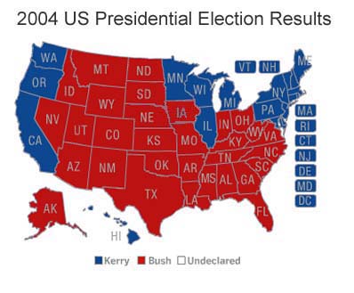
First let's look at the electoral map:
Share
But is America really that divided? Aren't there "purple states" that are near the middle? Indeed, most states were within 5%. Here are the states that are within 3%, as well as a chart of states by county, not just red or blue but the "in-between", followed by a chart from Robert J. Vanderbei at Princeton University.

That doesn't look too much like 50/50 either. Perhaps it is the fact that it is not by county, or that big empty states are preferred over small dense states. From Mr. Vanderbei's page:


Yes, the votes in New York City are more than the big empty West. But NY gets just a dot, even on this map.
For more information you can also go HERE to see other maps that have counties redrawn according to population size:
(From Michael Gastner, Cosma Shalizi, and Mark Newman, University of Michigan)

Okay, we know the election was very close, and that this business about the
country being red is hype, BUT WHO ARE THESE RED FOLKS?
Well, they don't read.
Here are the numbers on education for grade schools:
<---Back (Intro)---------HOME---------Next (Education) ---->